Storybook + Flutter = storybook_flutter
This article is all about promoting my Flutter library for showcasing isolated widgets and screens. Something like Storybook in the React world. Actually, it's even named storybook_flutter.
Why do you need it?
First, to speed up UI development. Yes, Flutter has a "hot reload" that makes UI development very smooth, but what if the widget you're developing is somewhere deep in the app screens? What if it's visible only under some specific conditions? Besides that, hot reload won't work in all cases. So the possibility to isolate the widget, make it a separate story, and work with this story could be very helpful.
Second, showcasing your widgets and screens. For example, we implement our own design library for Flutter and we'd like to integrate an interactive sandbox with widgets into our documentation. Especially now, when Flutter for Web is in stable channel.
Third, there's been a feature request from the very beginning: generating golden tests automatically with every possible combination of widget parameters. I find this idea pretty interesting, and I'd like to add this functionality in the future.
Can't you just use some existing library?
Probably, yes. But, at the moment there's no clear leader among the community libraries. Also, you can't just take NIH syndrome off the counter :) Besides that, I'd like to be able to add features we need as quickly as possible.
What does it look like?
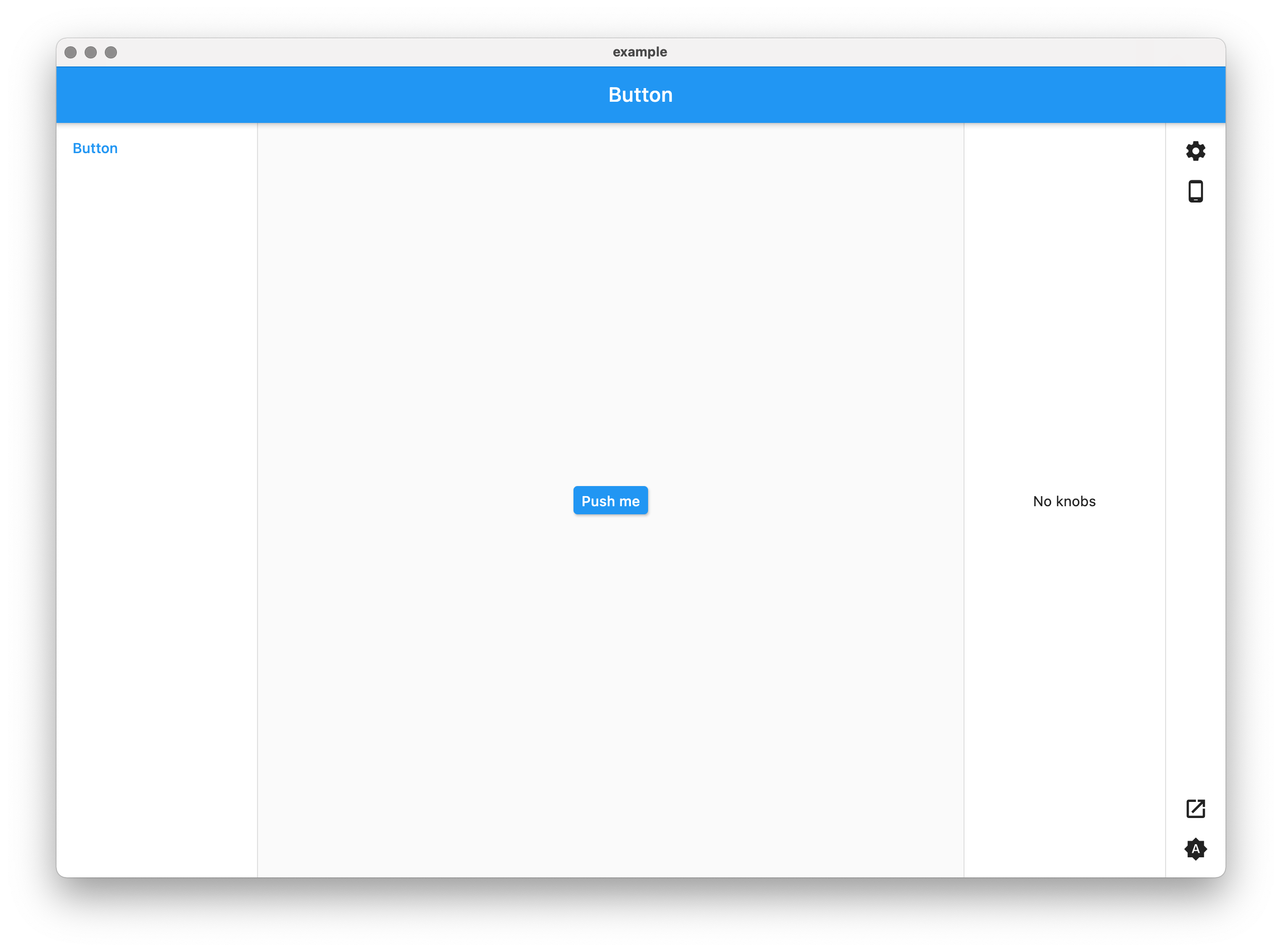
Somewhat like this:
Yep, not a piece of art, but that's not the first priority right now, and my design skill is a little subpar... Besides that, I'm still experimenting with the placement of buttons and toolbars, so it doesn't make sense to polish visual style at the moment.
What can you do with it?
- Story navigation with optional grouping by section.
- Knobs (customizable parameters) for widgets.
- Light/dark theme switch.
- Fullscreen mode for stories without any UI elements – can be used on the web, for example, to embed the story into iframe.
- Customization.
- Device frames (thanks to the device_frame package).
- Plugin support.
How to use it?
Add the dependency to the pubspec.yaml file:
storybook_flutter: ^0.5.0
Create the story. One of the simplest examples would be:
import 'package:flutter/material.dart';
import 'package:storybook_flutter.dart';
void main() => runApp(const MyApp());
class MyApp extends StatelessWidget {
const MyApp({Key? key}) : super(key: key);
Widget build(BuildContext context) => Storybook(
children: [
Story.simple(
name: 'Button',
child: ElevatedButton(
onPressed: () {},
child: const Text('Push me'),
),
),
],
);
}
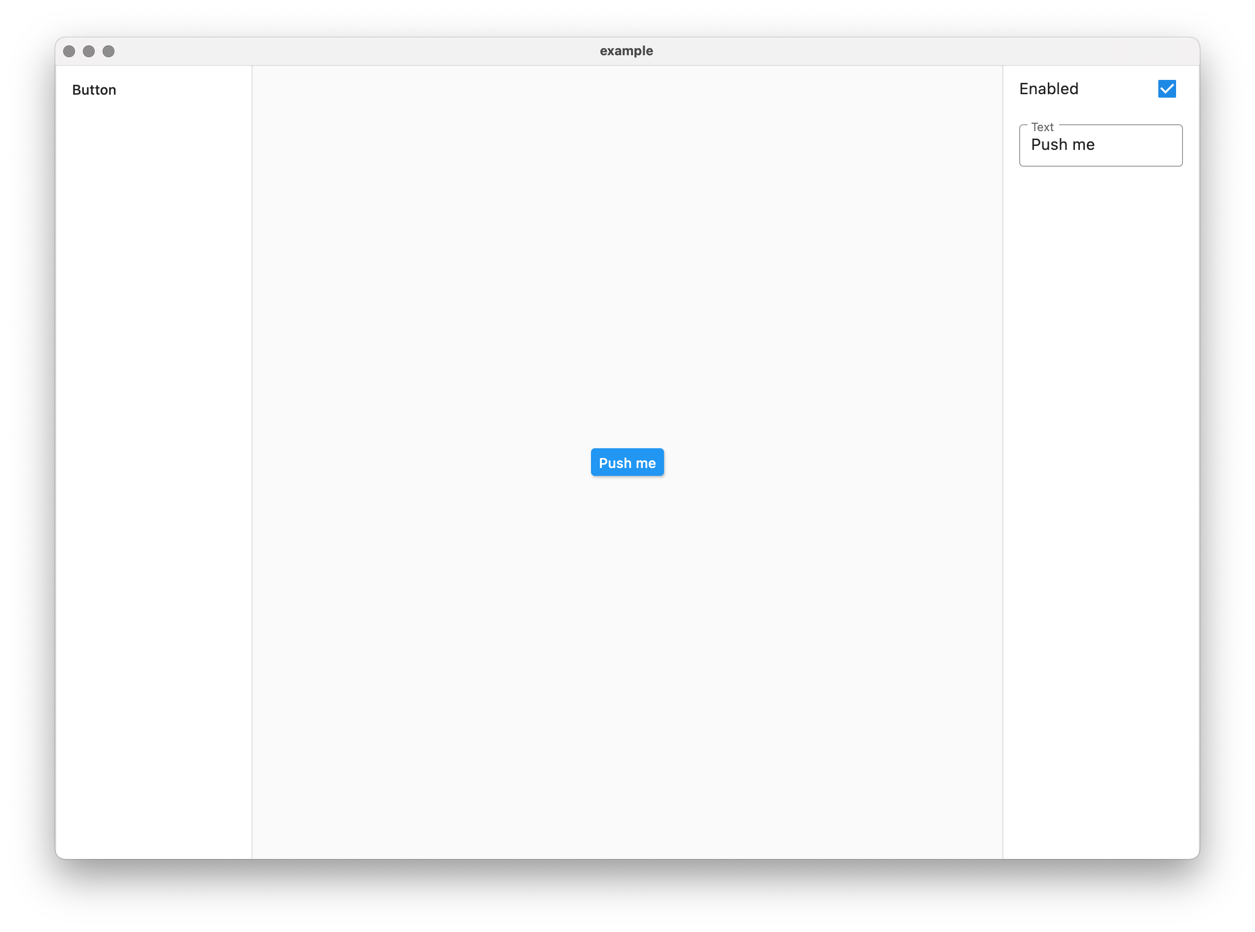
Run the project, and voilà:
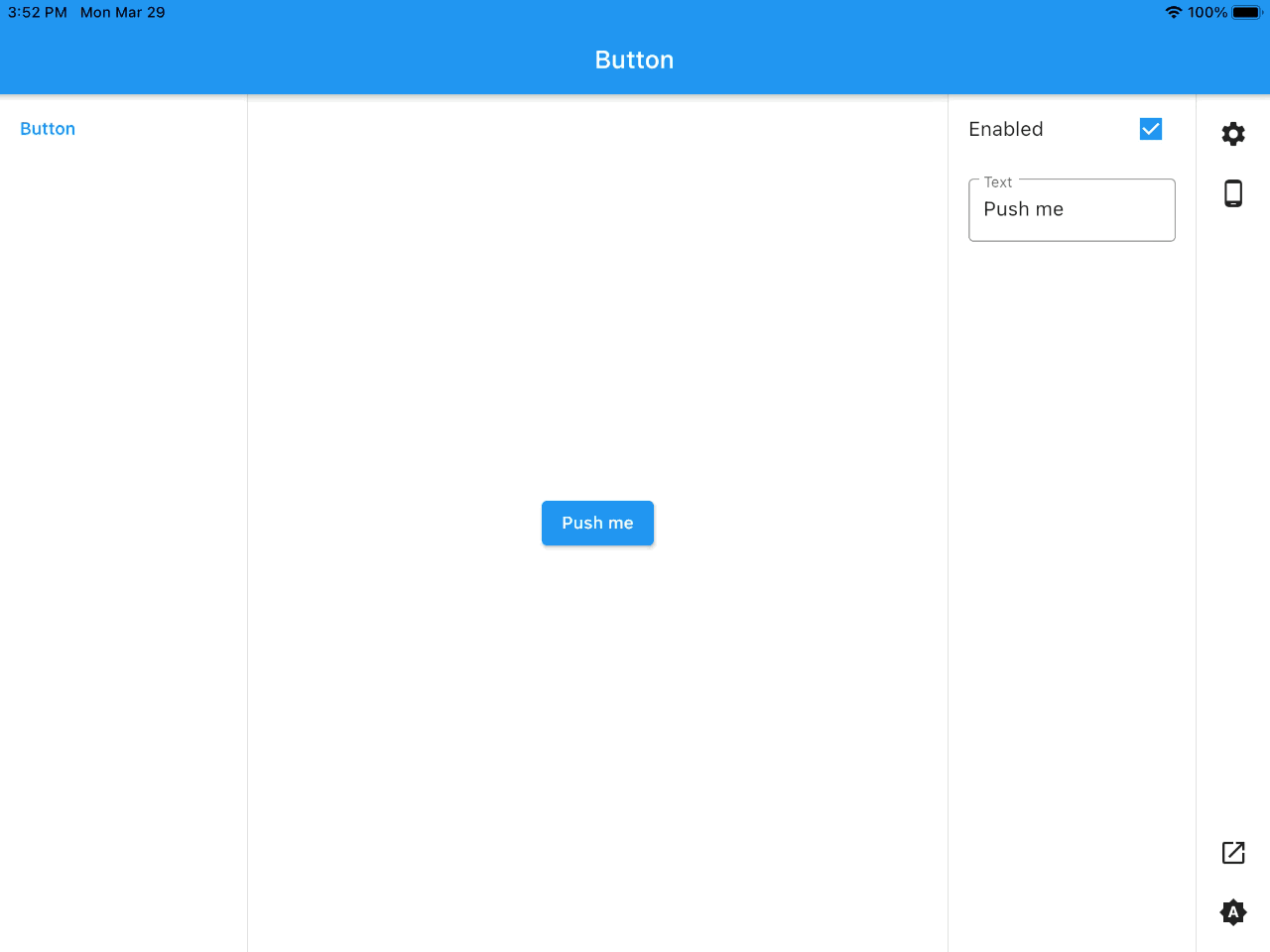
Let's add some knobs. All we need to do is to replace the simple constructor with a default one, and to use builder instead of child:
Story(
  name: 'Button',
  builder: (context, k) => ElevatedButton(
    onPressed:
        k.boolean(label: 'Enabled', initial: true) ? () {} : null,
    child: Text(k.text(label: 'Text', initial: 'Push me')),
  ),
),
Run the build again. It's even better now:
Grouping stories by sections is as simple as adding section parameter:
Story(
  name: 'Button',
  section: 'Buttons',
  builder: (context, k) => ElevatedButton(
    onPressed:
        k.boolean(label: 'Enabled', initial: true) ? () {} : null,
    child: Text(k.text(label: 'Text', initial: 'Push me')),
  ),
),
All the stories with the same section value will be grouped automatically.
How to customize it?
Each Story has padding and color parameters that control (Captain Obvious here) the padding and background color of the story:
Story(
  name: 'Button',
  section: 'Buttons',
  padding: const EdgeInsets.all(8),
  background: Colors.red,
  builder: (context, k) => ElevatedButton(
    onPressed:
        k.boolean(label: 'Enabled', initial: true) ? () {} : null,
    child: Text(k.text(label: 'Text', initial: 'Push me')),
  ),
),
But that's too simple. More interesting things can be done with the wrapperBuilder parameter. It allows wrapping the story with a custom widget:
Story(
  name: 'Button',
  section: 'Buttons',
  wrapperBuilder: (context, story, child) => Container(
    decoration: BoxDecoration(border: Border.all()),
    margin: const EdgeInsets.all(16),
    child: Center(child: child),
  ),
  builder: (context, k) => ElevatedButton(
    onPressed:
        k.boolean(label: 'Enabled', initial: true) ? () {} : null,
    child: Text(k.text(label: 'Text', initial: 'Push me')),
  ),
),
This builder can be passed as a value of the storyWrapperBuilder parameter in Storybook. In that case, each story will be wrapped with this widget (of course, you can still override it with a story's wrapperBuilder individually).
We need more customizations!
If builders, wrappers and parameters are not enough, you can take CustomStorybook and do everything yourself:
class MyApp extends StatelessWidget {
const MyApp({Key? key}) : super(key: key);
Widget build(BuildContext context) {
final decoration = BoxDecoration(
border: Border(
right: BorderSide(color: Theme.of(context).dividerColor),
left: BorderSide(color: Theme.of(context).dividerColor),
),
color: Theme.of(context).cardColor,
);
return MaterialApp(
debugShowCheckedModeBanner: false,
home: Scaffold(
body: CustomStorybook(
builder: (context) => Row(
children: [
Container(
width: 200,
decoration: decoration,
child: const Contents(),
),
const Expanded(child: CurrentStory()),
Container(
width: 200,
decoration: decoration,
child: const KnobPanel(),
),
],
),
children: [
Story(
name: 'Button',
builder: (context, k) => ElevatedButton(
onPressed:
k.boolean(label: 'Enabled', initial: true) ? () {} : null,
child: Text(k.text(label: 'Text', initial: 'Push me')),
),
)
],
),
),
);
}
}
You can still use built-in widgets: Contents, CurrentStory and KnobPanel (I bet you can guess what they do). We'll get some minimalistic result here:
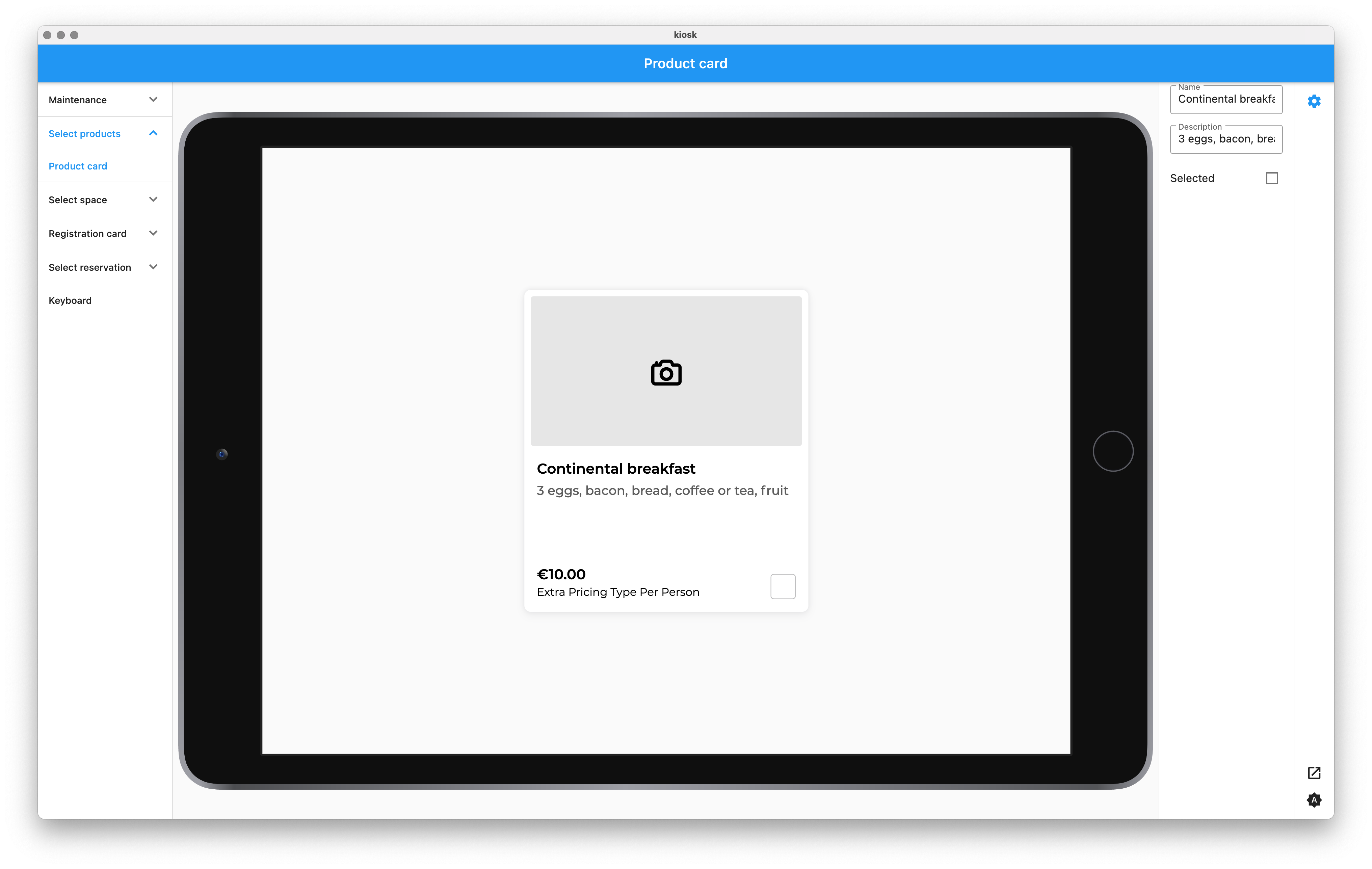
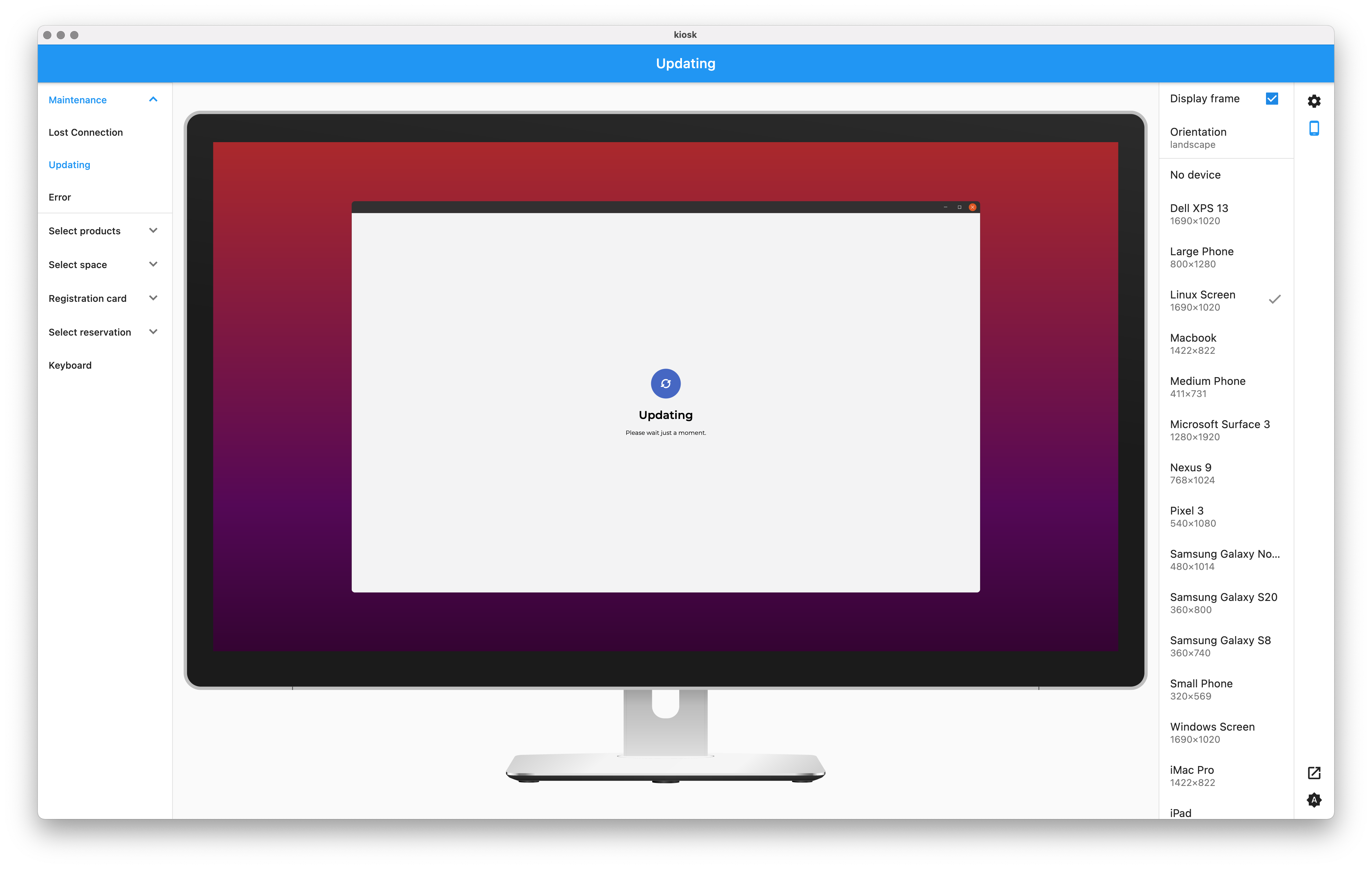
One of the possible use cases for CustomStorybook can be this plugin that adds Storybook to another package, device_preview, supporting contents and a knobs panel. With it you can achieve something like this:
What about plugins?
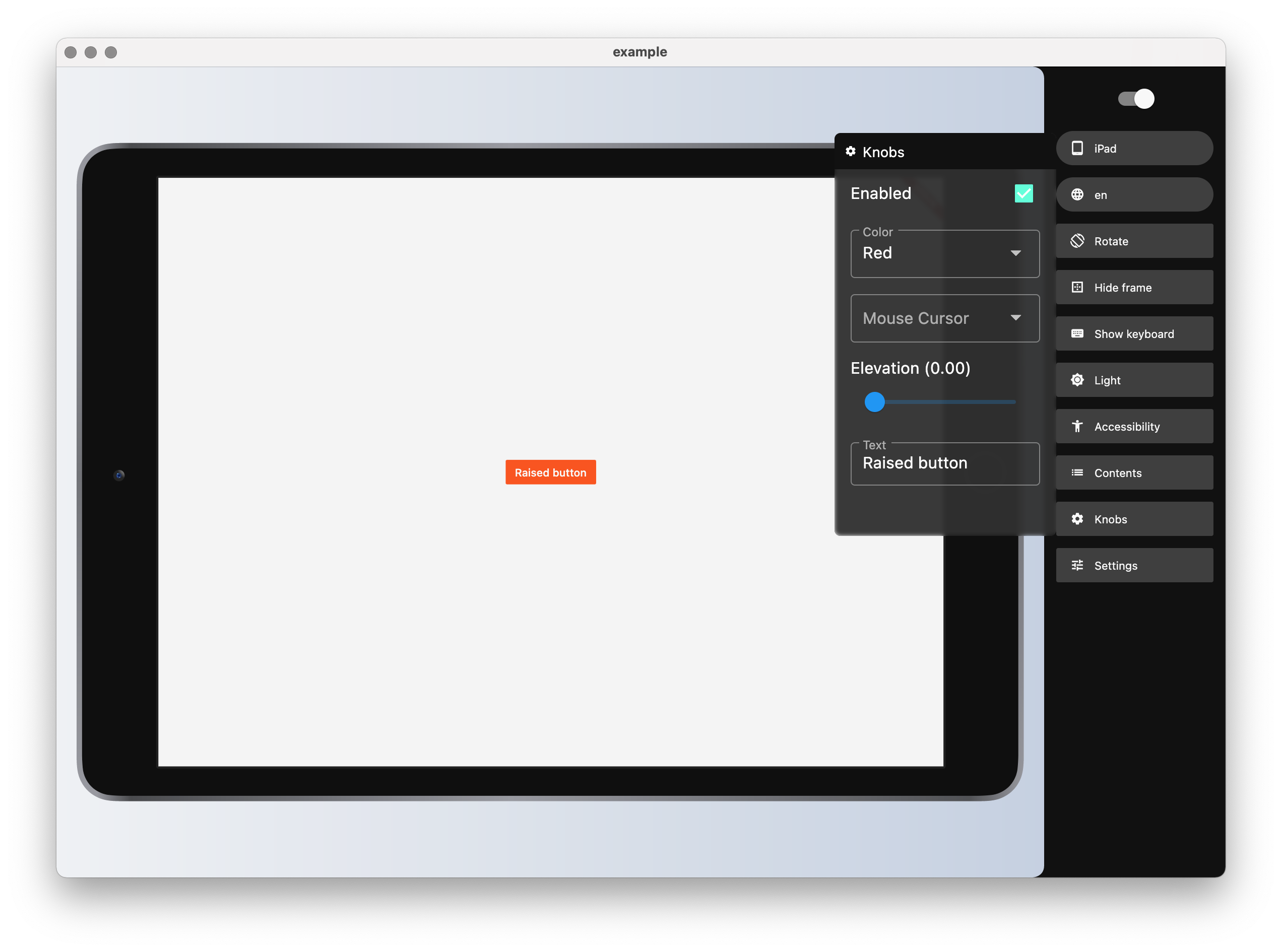
The latest version adds support for plugins and the first-party plugin, DeviceFramePlugin:
Plugins allow overriding the way stories are rendered, as well as add custom settings to the panel. Creating plugins is a topic for another article though.
Which platforms are supported?
Well, there's no special magic under the hood, so in theory it should work on all the platforms supported by Flutter. I've tested it on Android, iOS, web and macOS.
Any roadmap?
First, stabilize plugin API and think about what plugins should be provided out of the box (and develop them, of course).
After that, I think I will look into golden test generation, like I mentioned in the beginning.
That's it. Any comments, feature requests and bug reports are welcome (as well as likes and stars).